Line charts allow you to visualize change over a continuous range, such as time or distance. Visualizing change with a line chart allows the overall trend to be displayed at once, and multiple trends to be compared simultaneously.
Example
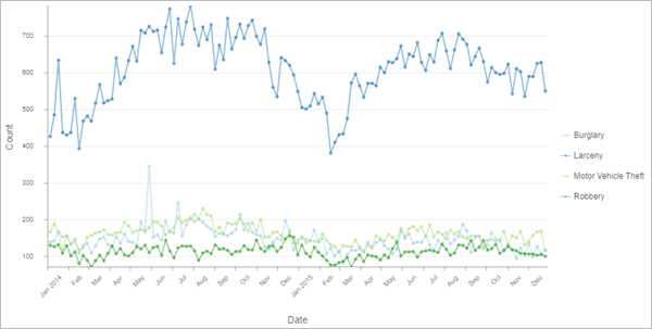
Create a line chart to visualize trends in crime incidents in 2014 and 2015.
- X-axis date or number—Date
- Aggregation—Count
- Numeric fields—None
- Split by—Crime type
- Interval—Six days
Data
The Data tab  configurations include the variables that are used to create the line chart.
Variables
Line charts require a continuous X-axis date or number variable and an associated numeric value on the y-axis.
The x-axis of a line chart displays a continuous variable such as time or distance, and a line is drawn visualizing the change in value between each consecutive time or distance interval. Each interval is marked with a point corresponding to a numeric value measured by the y-axis.
When a number field is chosen for the x-axis and each number appears in the table only once, no aggregation is necessary, but a Numeric fields variable must be specified.
When a date field is chosen for the x-axis, the dates are binned, or aggregated, into time intervals. When a line chart is drawn using a date field or an aggregated number field, an aggregation method must be chosen to specify how the data will be summarized.
If no numeric fields are specified, the chart will use the Count aggregation method, which totals the number of records that appear at each time or distance interval. For example, in a dataset of crime incidents, a date field is binned into two-week intervals with a Count aggregation method. The resulting chart will display a marker for every two-week interval representing how many crimes took place during those two weeks.
If Numeric fields values are specified, the aggregation method can be one of the following:
- Sum
- Mean
- Median
- No aggregation
Multiple series
Multiple lines, or series, can be visualized in the same chart to compare trends.
Multiple series line charts can be created by adding multiple numeric fields, or by setting a Split by category field.
When multiple Numeric fields values are added, one line is drawn to visualize the change for each numeric field. For example, in a dataset of crime incidents, a date field is binned into two-week intervals with a Sum aggregation method and two Numeric fields values, PropertyLoss and TotalDamage. The resulting chart will display two lines, one representing the sum of PropertyLoss and the other the sum of TotalDamage for every two-week interval.
A category field can also be used to split a line chart into multiple series. For example, in a dataset of crime incidents, a date field is binned into two-week intervals with a Count aggregation method and a CrimeType Split by field. The resulting chart will display lines representing the total number of crimes of each type (for example, Theft, Vandalism, and Arson) that took place during those two weeks.
Note:
A Split by category cannot be applied when more than one Numeric field value has been added.
Category fields with many unique values are not appropriate for splitting a field into multiple series.
Time binning
Time aggregation, or binning, occurs automatically when a date field is chosen for the x-axis. Several options control the interval size and related settings applied to the binning.
Interval
Temporal data is binned into time intervals along the x-axis. A default interval is chosen based on the temporal extent of the dataset and can be manually changed using the Interval parameter.
Interval alignment
Time intervals may align to the first data point or to the last data point.
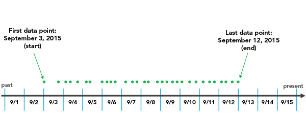
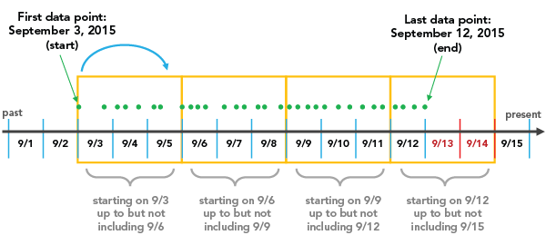
Snap to the first data point initiates binning with the earliest date and works forward.
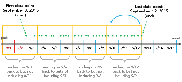
Snap to the last data point initiates binning with the most recent date and works backward.
Interval alignment is important to consider because the last bin created may be partially empty, which can give the misleading impression that there is a dip in the value or count during that time, when really the data collection began or ended during the span of that bin. To avoid bin bias, check the Trim incomplete interval option. This removes the partially filled bin from the visualization: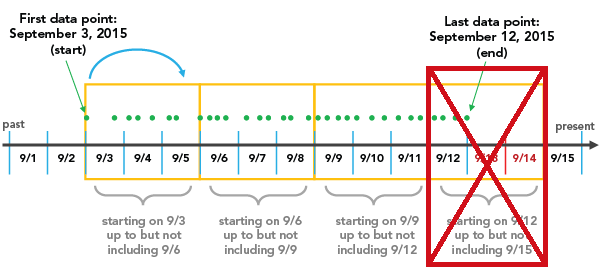
Empty bins
Depending on the sparsity of the dataset and the time interval size chosen for binning, there may be bins that contain no data. Empty bins may be treated as zero when a lack of data truly represents a value of zero (for example, no illnesses were reported in May or no rain was collected during a week span). It is not appropriate to assign a zero value to a bin in which no data exists because none was collected (for example, no reading from a temperature gauge does not mean there was a temperature of zero).
There are three options available for dealing with empty bins:
- Treat them as zero (Treat as zero)—This is most appropriate when counting incidents, as no incidents counted likely means zero incidents took place.
- Interpolate neighboring values (Connect line)—Null values can be visually interpolated by connecting the line between the bins on either side of the empty bin.
- Break the line (Break line)—Leave a blank space where an empty bin falls.
Labels
You can turn on labels that display the value of each line or series by enabling Show data labels.
Series
The Series tab  configurations are used to change the color, width, style, and label of a line on the line chart.
Axes
The Axes tab  configurations are used to change the specifications for the x-axis and y-axis.
You can format the way the x- and y-axes display numeric values by specifying the number of decimal places and whether to include a thousands separator. The x-axis can only be formatted if it displays a number field rather than a date field.
The default minimum and maximum y-axis bounds are set based on the range of data values represented on the y-axis. You can customize these values by typing new Minimum bounds and Maximum bounds values. Click Reset to revert the axis bound to the default value.
Logarithmic scale
By default, line chart axes are displayed on a linear scale. Numeric (nondate) axes can be displayed on a logarithmic scale using the Logarithmic scale slider.
Logarithmic scales are useful when visualizing data with large positive skew when the majority of data points have a small value, with a few data points with very large values. Changing the scale of the axis does not change the value of the data—only the way it is displayed.
Linear scales are based on addition, and logarithmic scales are based on multiplication.
On a linear scale, each increment on the axis represents the same distance in value. For example, in the axis diagram below, each increment on the axis increases by adding 10.

On a logarithmic scale, increments increase by magnitudes. In the axis diagram below, each increment on the axis increases by multiplying by 10.

Note:
Logarithmic scales cannot display negative values or zero. If you use a log scale for a variable containing negative values or zeros, those values will not appear on the chart.
Guides
The Guides tab  configurations are used to add guides or guide ranges to the chart.
Guide lines or ranges can be added to charts as a reference or way to highlight significant values. Guides are added by clicking the Add guide button then choosing Add X-axis guide or Add Y-axis guide.
Note:
X-axis guides are not supported for line charts using a date as the x-axis variable.
To create a guide line, enter a Start value where you want the line to draw. To create a guide range, enter a Start value and an End value. You can also change the appearance of the guide line or range. For lines, the style, width, and color can be updated. For ranges, the fill color can be updated.
You can optionally change the name of the guide using the Guide name parameter and add text to your guide using the Guide label parameter (for example, Median).
You can choose whether the guide renders on top of the chart or under the chart using the Above and Below buttons in the Render parameter.
Format
The Format tab  configurations are used to change the look of the chart by formatting text and symbol elements.
Chart formatting options include the following:
- Text elements—Size, color, and style of the font used for the chart title, x-axis title, y-axis title, legend title, description text, legend text, axis labels, and data labels. You can change the format for multiple elements at once by pressing Ctrl and clicking to select the elements.
- Symbol elements—Color, width, and style (Solid, Dot, or Dash) for grid and axis lines and the background color of the chart.
General
The General tab  configurations are used to update the titles for the chart, axes, and legend.
The default titles for charts and axes are based on the variable names and chart type. You can edit or turn off the titles on the General tab. You can also provide a title in the Legend title parameter. The Legend alignment can be set as Right, Left, Top, or Bottom. You can also add a chart description in the Description parameter. A description is a block of text that appears at the bottom of the chart window.
Resources
Use the following resources to learn more about charts:
- Configure charts
- Configure pop-ups to add charts
- Style numbers using Charts or Charts and Size